

This Chart Still Suggests Buying Bonds and Selling Stocks
With the recent hoopla surrounding the bond market and stock market these days, I think it’s important to take a step back and really put things into perspective. A chart that we brought up back in Maywas the US Treasury Bonds vs S&P500 ratio when it first approached the 2007 lows. I think where we stand today, this chart looks even better than it did then. Granted it’s up 10%, but still.
Here is the weekly line chart of the 20+ Year Treasury Bond ETF vs the S&P500 ETF. When this ratio is declining, the S&P500 is outperforming Treasury Bonds and when the ratio is rising, it’s the Treasury Bonds that are more in favor. So far we are bouncing nicely off this support and call me crazy, but it seems to me like there’s a lot more upside left::
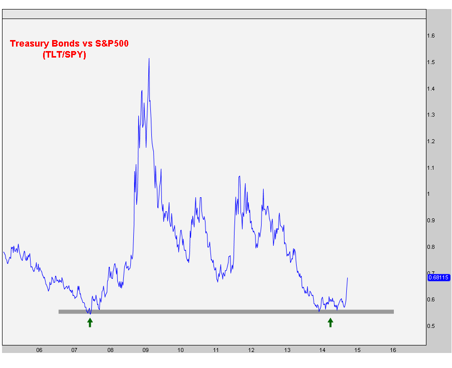
Obviously we only want to be on this side of the trade as long as the 2007 lows hold like they’ve done so far. So I think the risk/reward still favors bonds over stocks. I haven’t seen any evidence that would suggest otherwise.
What do you guys think?

Recent free content from J.C. Parets
-
 Here’s Way I think Rates Are Heading Lower
— 11/12/15
Here’s Way I think Rates Are Heading Lower
— 11/12/15
-
Support & Resistance 101: Apple Edition
— 11/10/15
-
 Video: Technical Analysis Webinar by JC Parets
— 10/01/15
Video: Technical Analysis Webinar by JC Parets
— 10/01/15
-
Find Your Edge: The Autumn 2015 AlphaShark Trading Symposium with a Presentation by J.C. Parets
— 9/25/15
-
Can Financials Correct 30% From Their Highs?
— 9/24/15
-
{[comment.author.username]} {[comment.author.username]} — Marketfy Staff — Maven — Member

- 1 Campus Martius, Suite #200Detroit, MI 48226
- +1 877 440 9464